Graphic Designer
Sodexo Card Designs
Print-ready gift card artwork for SoGo Cash Card, designed for clients across corporate, healthcare, education, and government sectors.
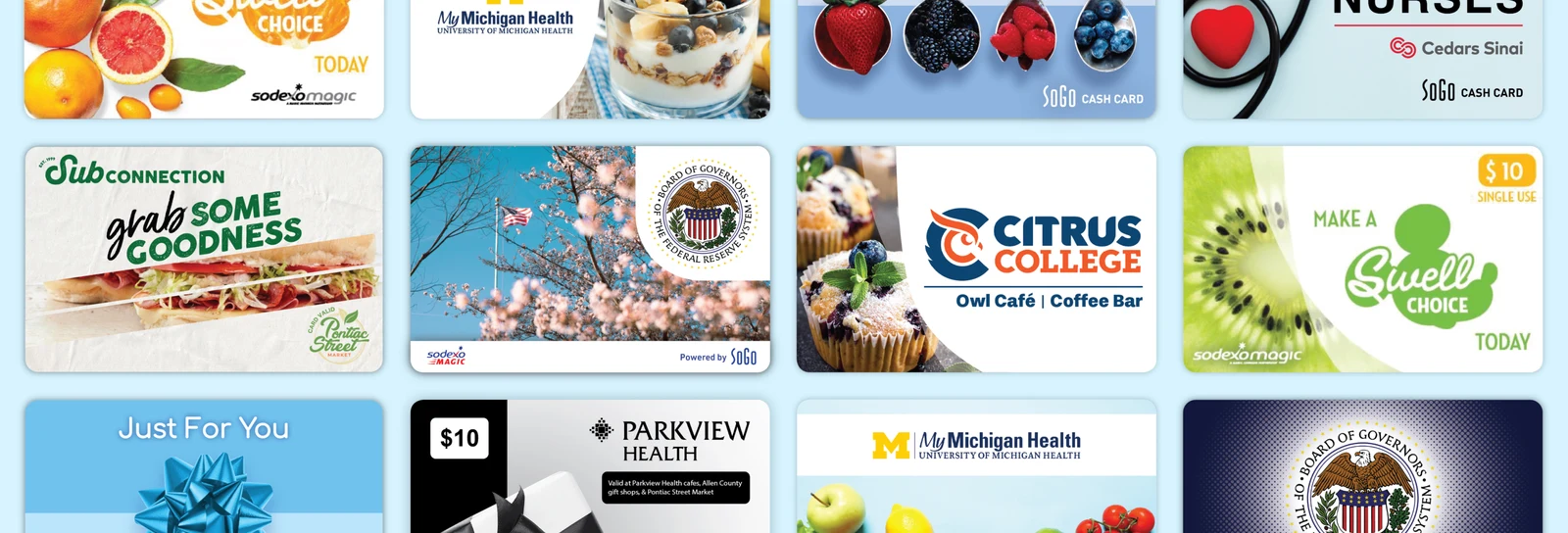
Overview 📝
As a Graphic Designer for SoGo Cash Card, a department within Sodexo, I design gift card artwork for clients across corporate, healthcare, education, and government sectors. Every card follows the same print-ready production process. Selected examples below represent a portion of the gift card designs I created.
Card Print Production Process 🖨️
Each client provides their brand assets and content requirements. From there, I present a set of design options, iterate based on feedback, and finalize the design for print. Every card is built to real print specification, front and back, including legal language required for card compliance.
- Safe zone (blue line): logos and key content stay inside this boundary to avoid trimming
- Die line (pink line): the actual cut edge; bleed extends fully to the artboard edge to prevent white edges after trimming
- Color: Pantone spot colors used where brand accuracy requires exact color matching
- Resolution: all imagery set to 300 PPI for print
- Card backs: built to include magnetic stripe, PIN code, barcode, and/or card number placement as required per client
Due to confidentiality agreements, card back designs and legal language are not shown for all clients.

Federal Reserve 🏛️
Designed 6 gift card artwork for the Board of Governors of the Federal Reserve System.


Disney 🎡
Designed three gift card concepts for Disney, featuring their Swell Choice branding.

SoGo Cash Card 🎁
Designed a set of 7 special occasion gift cards for SoGo Cash Card using a pastel duo-tone color palette.


My Michigan Health 🏥
I've 4 gift cards for My Michigan Health, each built for a distinct use case: new orientation, residents, reloadable balances, and staff thank-you.

Parkview Health 🩺
Designed 2 black-and-white gift cards ($7 and $10) for Parkview Health, a cost-saving choice from the client to reduce ink costs, with the dollar amount and usage details clearly displayed on the front for staff.


Cedars Sinai 💙
I designed a Nurses Week appreciation card for Cedars Sinai's nursing staff, thanking them for all that they do.

Citrus College 🎓
Designed a gift card for Citrus College, including supporting text explaining where the card can be used.

SubConnection 🥪
Designed a gift card for SubConnection, incorporating their food photography. The client, initially wanting 1 gift card, liked 2 directions enough to choose both, resulting in 2 distinct cards going to production.

The Good Eating Company 🍽️
I designed two gift card designs for The Good Eating Company.

Conclusion 🏁
Working across dozens of clients reinforced a few production fundamentals:
- Pantone spot colors and 300 PPI imagery kept color and quality accurate and consistent across every print run, and test prints before final production caught any issues before mass printing.
- Just as important was communicating usage clearly, when relevant, cardholders needed to know where a card could be used and its dollar value at a glance, so that information was designed to be visually immediate, not buried in fine print.