UI Design & Prototyping Coursework
UI & Prototyping
A showcase of UI design and prototyping skills built across a 16-week Prototyping course, from design systems and variables to a full interactive resource guide.
Overview 📝
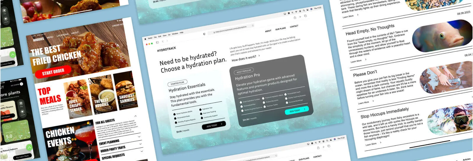
This page showcases UI design and prototyping skills built across a 16-week Prototyping II course, spanning four distinct interface designs, a full variables-driven design system across three viewports and four modes, and a final interactive prototype. Each section below covers the specific Figma techniques used and how they were applied.
UI Designs 🖼️
One of the projects I worked on in class involved designing four unique UI interfaces in Figma, each with distinct text, color, and effect styles. Text styles include varied font weights, and color palettes are customized for each theme, such as Sprout's earthy colors. Designs feature effects like drop shadows and background blur, and I considered specific UI elements, incorporating status bars and home indicators for adaptability.

Below, using the second design, Nuggies, as an example, are visuals demonstrating these styles along with my emphasis on file hygiene and layer organization.

Auto layout
For these designs, I used Figma's Auto Layout feature, a powerful tool for responsive design. This functionality played a crucial role in maintaining a consistent design flow throughout my UI designs, letting content adapt dynamically. Here's how I used Auto Layout in a section from my first design, Sprout.
Redlining
Redlining is a technique that annotates a UI design with lines specifying exact spacing and dimensions. This approach simplifies handoff to developers, enhances visual appeal by keeping a consistent rhythm, and contributes to a visually unified layout. Across these four UI designs, I consistently applied an 8-point grid and redlining; a couple of examples are below.


Feel free to explore these UI designs in my Figma file: text, color, and effect styles, status bars, home indicators, redlining, and auto layout, all in the "01. UI/Auto Layout Assignment" page.
Use of Variables 👾
Variables are values that can vary or take on multiple values. In Figma, variables store reusable values, like colors and numbers, that apply across design properties and prototypes. A variable's values can also reference other variables, making design systems easy to update.
To demonstrate my use of variables in Figma, I created a single UI design implemented across three viewports (desktop, tablet, and mobile) and four modes (light and dark, modern and brutal). In total, I created 12 screens across 3 sections, all with auto layout and an 8-point grid.


To accomplish this, I created variables using three collections: Primitives, Tokens, and Breakpoints/Viewports.
Primitives
The Primitives collection holds the basic color, space, and radius values. Colors are laid out with a numerical naming method using the Eva Design System color selector, organized into four groups: Primary (brand color), Accents (used sparingly to emphasize actions or information), Neutrals, and Semantics (success, warning, error, info).


For spacing, I used an 8-point grid with a naming system based on multiples of 8: the variable "1" corresponds to 8 points, "3" to 24 points. Radius indicates the degree of roundness for corners; the variable "sm" is a small value of 24.


Tokens
The Tokens collection holds semantic values, indicating where color and sizing values should be applied. Tokens inherit their values from Primitives and follow a logical, consistent naming convention.


Breakpoints and viewports
The breakpoints and viewports collection defines how the design adapts to different viewports. Certain elements may be shown or hidden by viewport (for example, the search bar appears only on desktop), and element sizing may change too. Establishing these variables makes it easy to adjust the design across viewports.


Switching modes
Variables make it easy for a design to adjust to different viewports and styles. As an example, I can easily switch the mode (light/dark and modern/brutal) of the UI design.
Prototyping with variables
As an example of prototyping with variables, I created two screens for light and dark mode. With one button, the screen can switch between the two.
Components
Components were created for elements used repeatedly, ensuring consistency and easy reuse. For elements with variations, I used component properties, specific customizable aspects of a component that can be defined to create multiple variations for elements like the macaron card.

Feel free to explore these variables, modes, and breakpoints in my Figma file. See the colors, spacing variables, and auto layout in the "02. Variables Assignment" page.
Final Project 👩🏻💻
To combine everything I learned in class, I created a League of Legends Champion Resource guide for desktop. This project also shows my ability to interpret and apply an existing brand guideline, extending the existing framework rather than introducing entirely new elements.
Centered around League of Legends, a competitive online multiplayer game by Riot Games, this project targets patch 13.23. The prototype is a comprehensive resource guide for champions, consolidating details such as name, titles, class, difficulty, abilities, cost, skinline, region, and lore, giving users a seamless way to access key information within the League of Legends universe.
Components
I used components since there were many reusable elements, letting me create variations as needed. Below are a few examples: the navigation bar, footer, and a sidebar for the Champions page.

While I created many components, the champion cards were a key one. With patch 13.23 featuring 165 different champions, I needed a corresponding number of cards, each with distinct properties such as name, cost, and role. To streamline this, I established component properties enabling swift edits to each card.

Leveraging component variants also let me add a hover effect: on hover, elements change slightly to add a layer of interactivity to the prototype.
Champion page
After creating 165 champion cards, I wanted to simplify the search for a specific champion. I implemented a sidebar as a filter, letting users navigate through categories. As a proof of concept, users can choose the first options in each sidebar category and select the first champion card.
Selecting champions
Selecting a champion card opens their dedicated page, with a visual of the champion integrated into the background and details like skinline, name, lore, cost, and role. Scrolling down reveals each ability with a gif illustrating it in action, alongside descriptive text explaining its functionality.
At the top of the page, users can browse the champion's skinline with a carousel, built using variables and components.
For the abilities section, I mainly used component variants to show a champion's different abilities.
World map
Finally, I wanted a page showing the world map of League of Legends, Runeterra, and its nations. On first click, users see the map as a background; it zooms out to reveal the page name and a button, and clicking that button zooms into the background to reveal all the nations of Runeterra.
As a proof of concept, users can select the first nation in the list, Bandle City, to learn about it, then scroll to view the list of champions from Bandle City and select one to view their champion page.
Feel free to explore this project through the file or the prototype: interactions, UI design, colors, text, components, variables, auto layout, redlining, and more, all in the "03. Final Project" page.
Conclusion 🏁
Across this course, I built four distinct UI designs, a full variables-based design system spanning three viewports and four modes, and an interactive League of Legends resource prototype with 165 champion cards, all in Figma using variables, components, redlining, and Auto Layout.
Key takeaways 🔑
- Variables gave the whole system a dynamic, easily updatable foundation for colors, spacing, and radius across every screen and mode.
- Component properties made it possible to manage 165 champion cards from a single source of truth instead of maintaining each one individually.
- Designing across three viewports and four modes from one variable system showed me how much responsive, scalable design depends on the underlying structure, not just the visuals.